
Marketplace
Public Safety Marketplace
Created an intuitive, content rich platform to support public safety professionals in discovering, purchasing, and creating applications or services that enhance their mission.
Role
Product Designer, Product Strategist, Product Implementor
Duration
Feb 2019 - Oct 2020
Objective
Enhance the client as THE leader in Public Safety solutions.
Background
Developed to empower public safety professionals in completing their missions, while supporting interoperability and industry standards.
Goals
Add revenue generating features
Grow usage among customers and vendors
Introduce account retention features
Stay ahead of the competitors
Our Approach
Structured, Flexible, Outcome-Driven
While presented in six steps, our process is adaptive and iterative by design. Grounded in Agile thinking, it engages the full team from the outset—allowing ideas, feedback, and progress to evolve in real time. Each phase informs and refines the next, promoting speed, clarity, and alignment.
1. Discover
We aligned on the product vision and gathered input from all stakeholders. Through competitive analysis, market research, and user interviews, we uncovered key insights about user needs and gaps in existing solutions.
Goals:
Understand the user goals and tasks
Explore the public safety domain
Identify the target audience
Analyze competitors' strengths and weaknesses
Capture lessons learned from similar products
Competitor Analysis
Analyzed key design elements—features, flows, emotional tone—to position our product experience as superior and differentiated.
User Needs
Defined the core goals, values, and motivations driving user behavior—establishing the foundation for design thinking and decision-making.

2. Strategize
Synthesized insights from discovery into a clear product definition. Identified challenges, framed design problems, and established the strategic foundation to guide design and development.
Conducted gap analysis to pinpoint competitor weaknesses
Identified differentiators to elevate our market position
Reviewed industry standards to inform compliance
Created business process flows to structure logic and interactions
3. Ideate
With goals defined, we explored a wide range of potential solutions. Collaboratively generated concepts and tested wire-frames to quickly validate early ideas.
Explored multiple low-fidelity wire-frames for each key screen
Evaluated usability flows and navigational logic
Combined best elements to form end-to-end experience prototypes
Example: App Submission Flow
Enabled vendors to upload and manage their offerings through a guided interface in the developer portal.
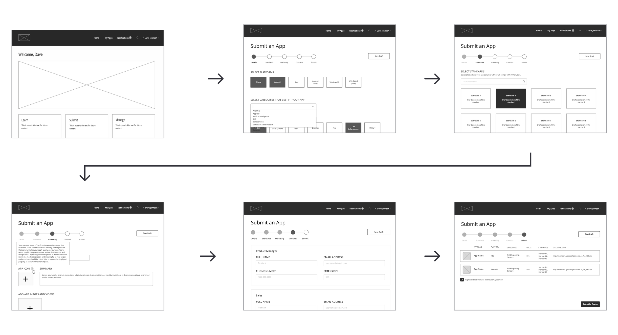
The app submission flow in the developer portal allows vendors to upload products to the marketplace.
4. Evaluate
Promising ideas were developed into branded, responsive interfaces and validated for consistency, usability, and alignment with design systems.
Visual Design & Branding
We ensured all design elements felt cohesive and on-brand:
Color Palette: Bold black/white base with blue accents for interactivity
Buttons: Designed as high-contrast, prominent CTAs
Iconography: Minimal, monochromatic, and consistent
Cards: Structured components with clear actions and tooltips
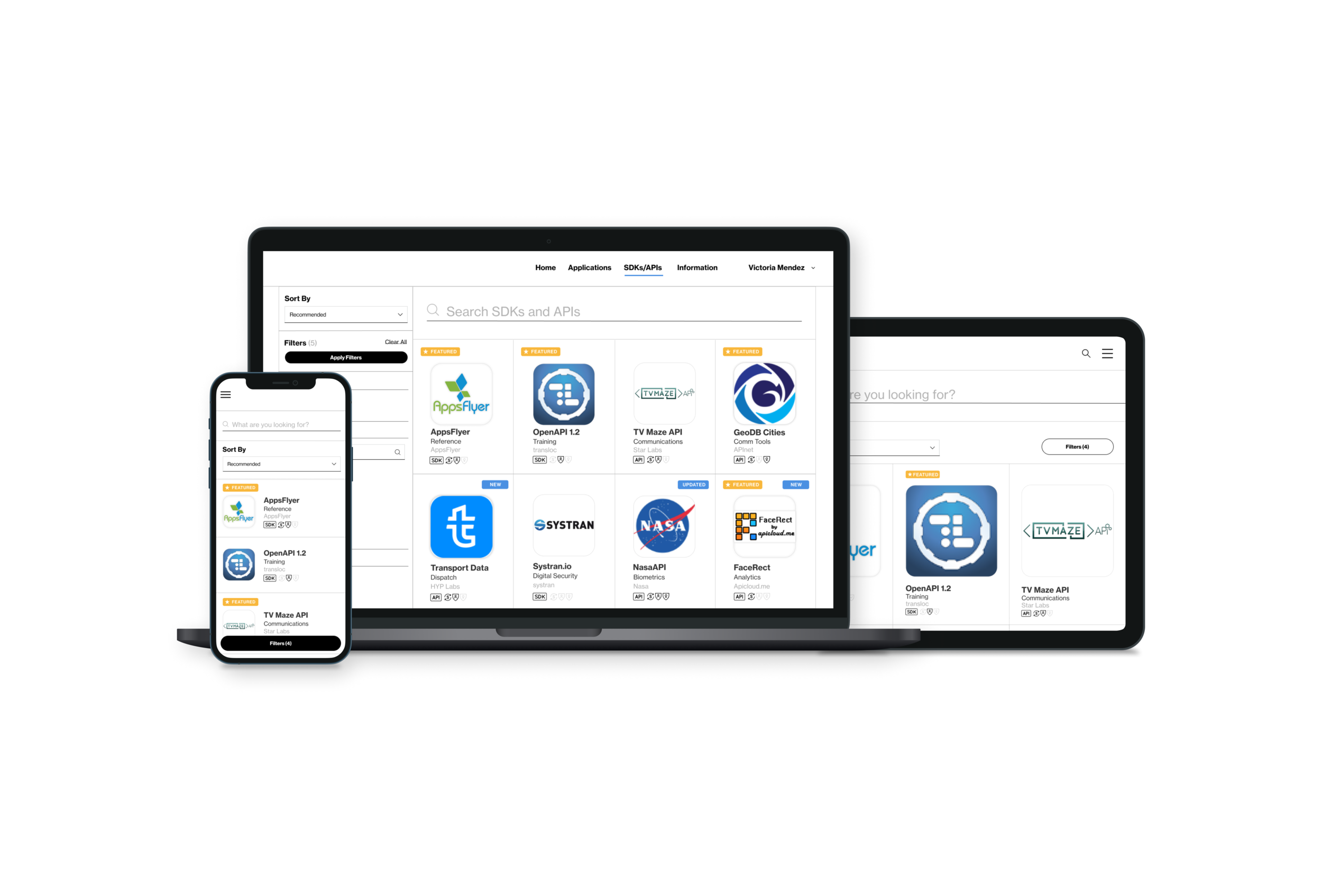
Example Screens
Browse Page: Filters and product discovery tools
Product Page: Tabbed views, multimedia carousel, persistent navigation
The “Browse” Page
Users need a way to discover new products and download applications.
The filters on the left are recognizable and are easy to navigate. Users can quickly sort and filter between products based on name, vendor, standards, etc.

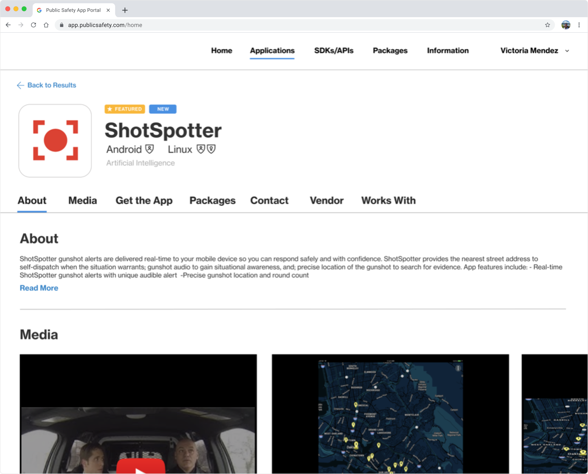
The “Product” Page
Users are presented with product highlights that are relevant to the usage of the product. The page is set up with tabs for easy access to information about the product and are treated to a visual carousel containing images or videos explaining the product. Navigation is always persistent and available to move through the pages.
Branding

Color Palette
We also used the colors from the client’s existing brand colors, emphasizing bold black and white designs. Blue is used sparingly to provide emphasis and indicate active selection.

Buttons & Toggles
The button component in the client’s design system is prominent and attention-getting with more visual emphasis than any of the text link components. It’s meant to stand out on a page of content as a prominent call to action with bold contrast.

Iconography
Following the cilent’s branding guidelines, we used icons that are simple in style. Icons are only black and white and minimal with thin strokes.
They help customers understand the interface, explain functionality and draw attention to interactive elements. Each icon has a specific purpose but all look like part of the same family.

Cards
1. Subtitle
2. Title Large
3. Body
4. Tooltip
5. Primary Call to Action
6. Secondary Call to Action
5. Interpret
Developed high-fidelity prototypes and tested key workflows with users. Feedback informed refinements to structure, navigation, and labeling.
Created clickable Figma prototypes for key user flows
Conducted usability testing to identify friction points
Used insights to optimize information architecture and page layouts
Try clicking* through our design prototype below to experience the flow first-hand:
* To use the Figma prototype, click anywhere on either image above. Action areas are highlighted on the click. Click within an action area to move through the prototype links. The prototype allows us to simulate the user experience early in the development process.
6. Define
Synthesized design, research, and testing into final implementation-ready assets. Delivered a complete blueprint for development.
Test & Iterate
Collected user feedback post-launch to guide enhancements
Identified improvement areas for future versions
Applied feedback loops to evolve product experience
Results & Takeaways
Key Lessons:
Develop a clear strategic launch plan to reduce scope creep
Keep user testing ongoing—even after launch
Involve engineering early to reduce rework
Achievements:
Delivered concept-to-launch execution
Designed an engaging, branded experience
Iteratively refined UX through continuous feedback